ILYASSE MARRAK / CASE STUDIES

Selected

work.

Different brands. Different challenges.
The same attention to what makes each one matter.

Carecierge — website preview
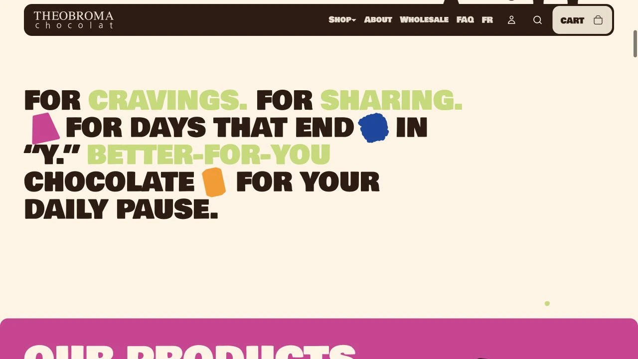
Theobroma Chocolat — website preview
Hatch — website preview

10 PROJECTS

10 real projects / Selected client work

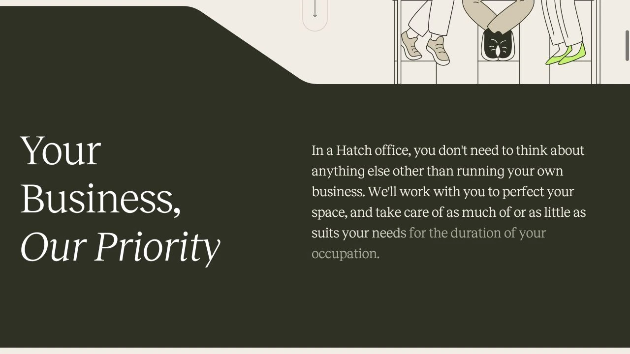
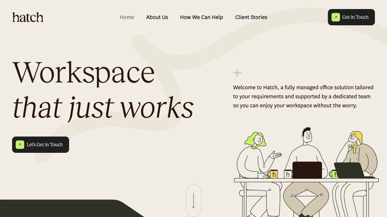
Hatch — website preview
Hatch — project detail 1
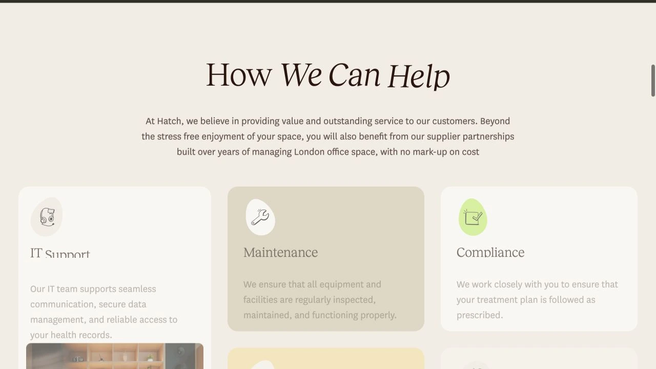
Hatch — project detail 2

01 / Workspace & Property

$1,000

Hatch

A welcoming digital home for fully managed workspaces.

01 / PROJECT OVERVIEW

Hatch presents a fully managed office service, helping businesses explore workspace support and start a conversation with the team.

02 / DESIGN APPROACH

Warm cream surfaces, olive accents, editorial serif typography, and character illustrations give the site a friendly tone. Service sections and clear contact links organize the journey from introduction to inquiry.

03 / PROJECT DETAILS

Hatch had a simple promise: give businesses a workspace without the headaches that usually come with running one. IT, maintenance, utilities, security — they handle the boring stuff so their clients can focus on what actually matters. Their business.

The challenge? Making a service with so many moving parts feel effortless.

I designed a website that communicates exactly that. Warm colors, friendly illustrations, elegant typography, and a straightforward experience that makes understanding their services easy.

Because when you’re selling peace of mind, your website shouldn’t create more work for the people visiting it.

PROJECT BUDGET (USD)

$1,000

COLOR PALETTE

Green / Neutral

Hatch — project detail 1
Hatch — project detail 2
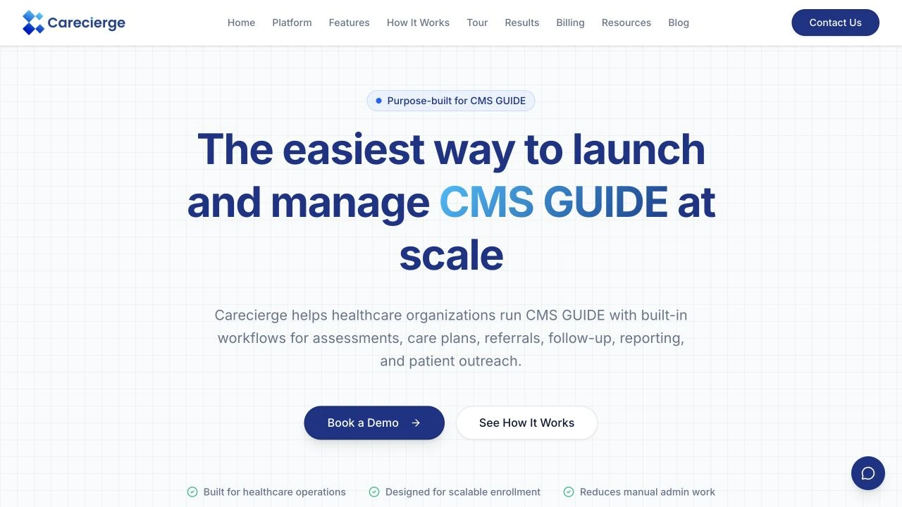
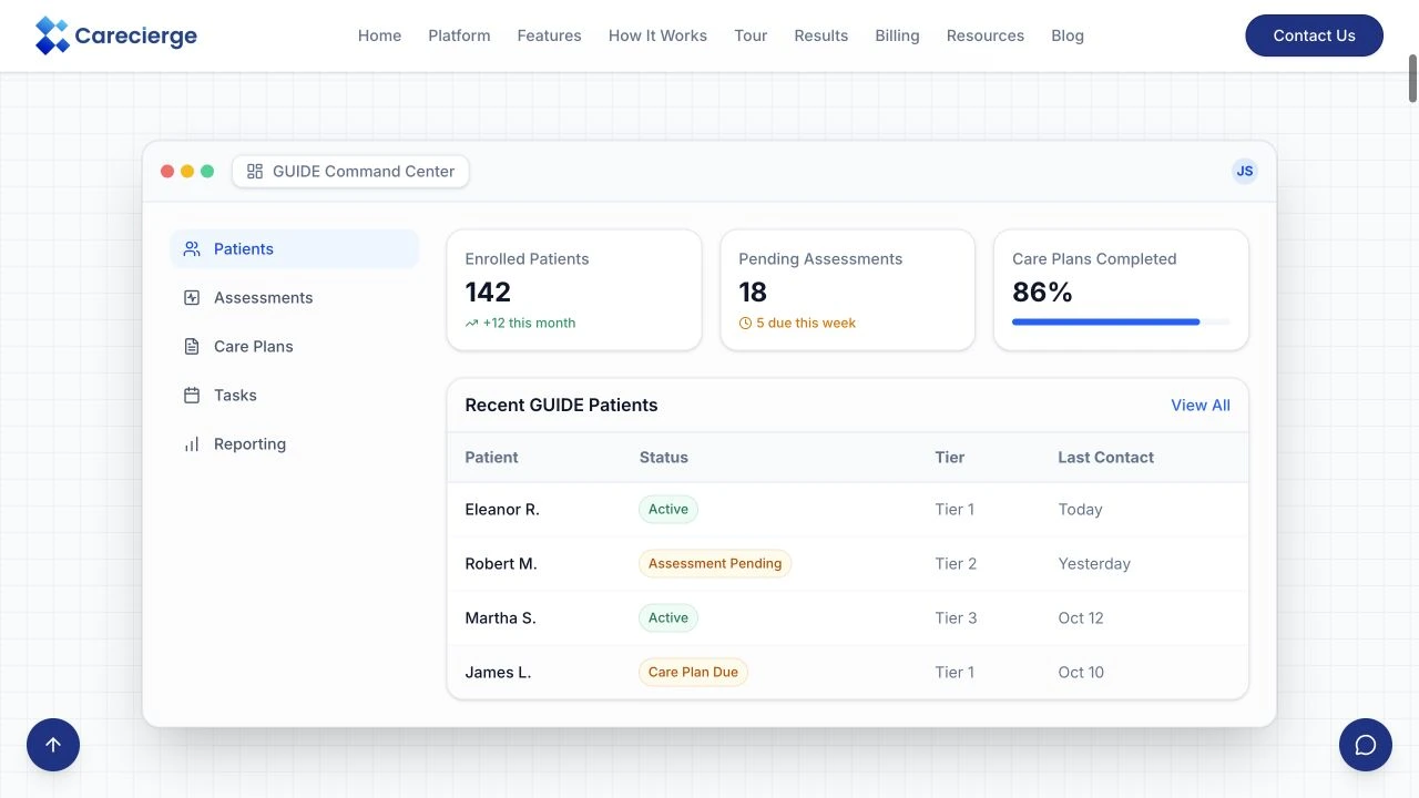
Carecierge — website preview
Carecierge — project detail 1
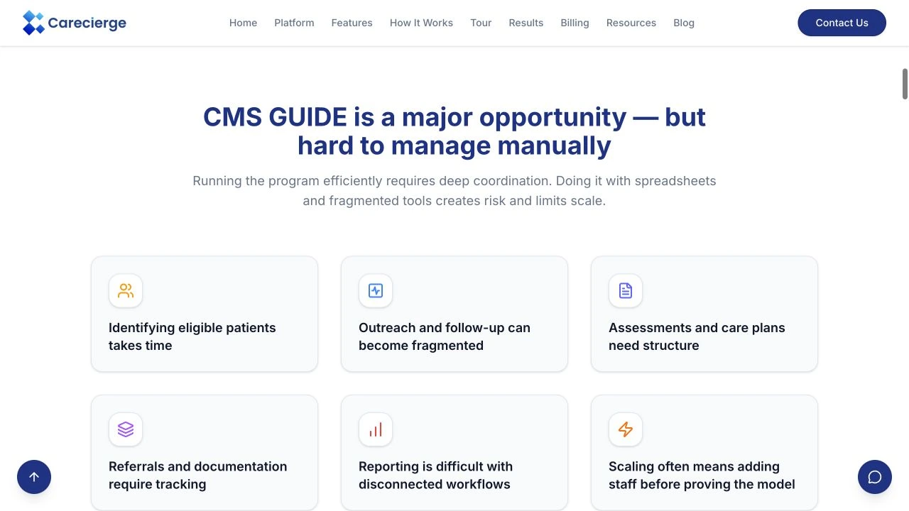
Carecierge — project detail 2

02 / Healthcare

$1,200

Carecierge

Making a healthcare operations platform clear and approachable.

01 / PROJECT OVERVIEW

Carecierge introduces software for healthcare organizations running the CMS GUIDE program, covering coordinated workflows, assessments, care plans, and reporting.

02 / DESIGN APPROACH

A blue-and-white visual system, structured feature sections, and interface previews explain the platform. Prominent demo links provide a clear next step for healthcare teams.

03 / PROJECT DETAILS

Healthcare is complicated enough. The software designed to make it easier shouldn’t be.

Carecierge helps healthcare organizations manage complex care workflows, from patient assessments and care plans to reporting. The technology is powerful, but explaining that technology to the people who actually need it was the real challenge.

My approach was simple: make the complex feel accessible.

I built a clean, structured digital experience using a trustworthy blue-and-white identity, clear feature explanations, and carefully placed calls to action. Every section has a purpose, guiding healthcare professionals from understanding the platform to booking a demo.

Less confusion. More clarity. And a website that lets the technology speak for itself.

PROJECT BUDGET (USD)

$1,200

COLOR PALETTE

Blue / Neutral

Carecierge — project detail 1
Carecierge — project detail 2
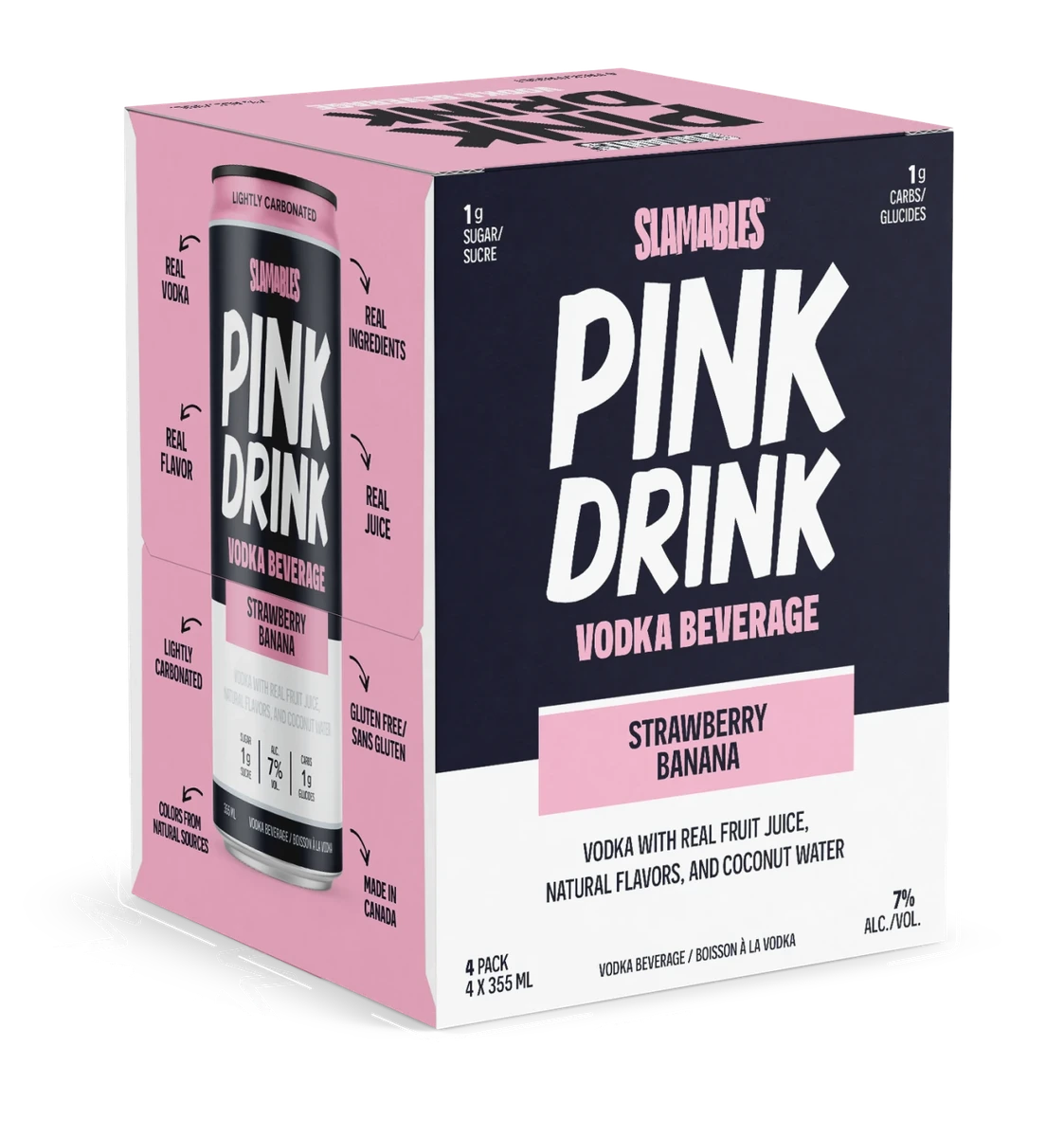
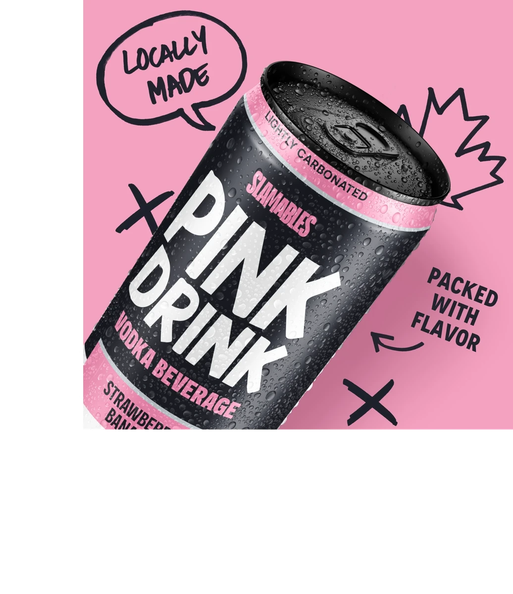
Slamables — website preview
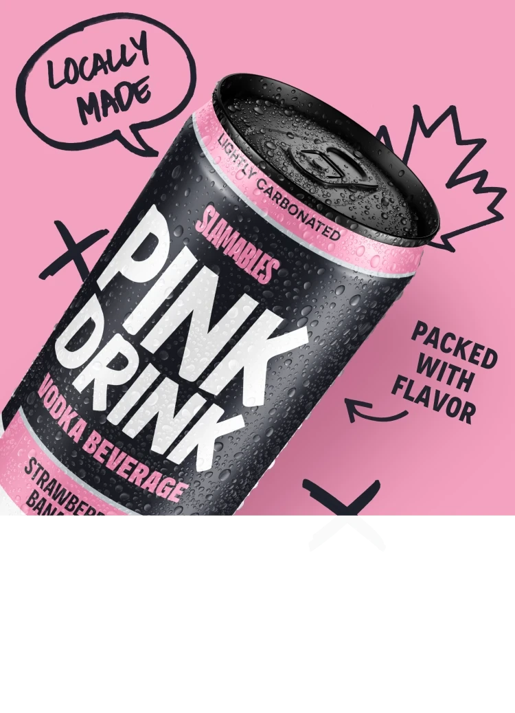
Slamables — project detail 1
Slamables — project detail 2

03 / Food & Beverage

$800

Slamables

A bold digital identity for a drink with a distinctly pink personality.

01 / PROJECT OVERVIEW

Slamables presents its Pink Drink, brand story, merchandise, and retail locations in an expressive beverage website.

02 / DESIGN APPROACH

Pink product imagery, a dark backdrop, and condensed display typography put the brand’s personality first. The experience connects product discovery with the brand story, shop, and store locator.

03 / PROJECT DETAILS

Slamables already had something most brands spend years trying to build: personality.

Bold, unapologetic, and impossible to confuse with another brand. The challenge was translating that identity into a digital experience without losing what made it different.

I took the brand’s signature pink and pushed it to the front, pairing it with dark backgrounds, oversized typography, and striking product visuals.

But a strong visual identity alone isn’t enough. I also created a clear structure that brings the brand story, imagery, and content together in one cohesive experience.

The result is a website with the same attitude as the brand itself. Loud where it needs to be, simple where it matters.

PROJECT BUDGET (USD)

$800

COLOR PALETTE

Pink / Black

Slamables — project detail 1
Slamables — project detail 2

Product and brand imagery from the live Slamables website.

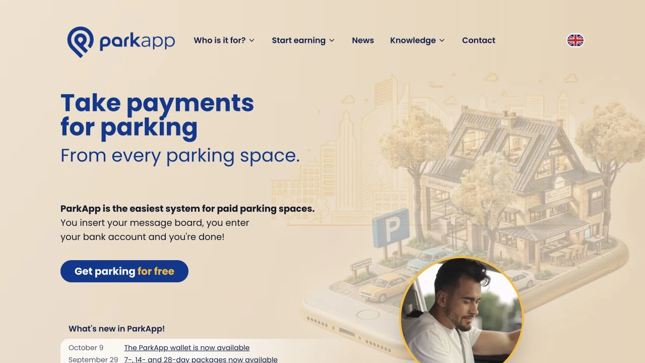
ParkApp — website preview
ParkApp — project detail 1
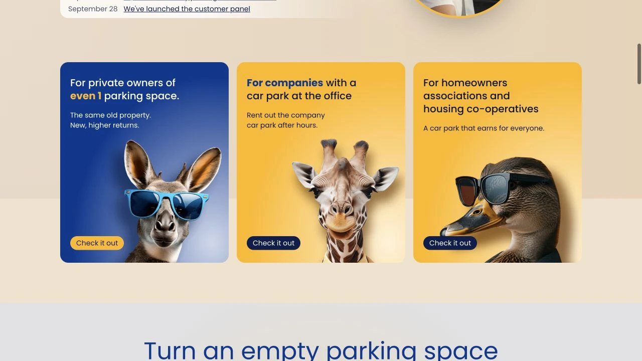
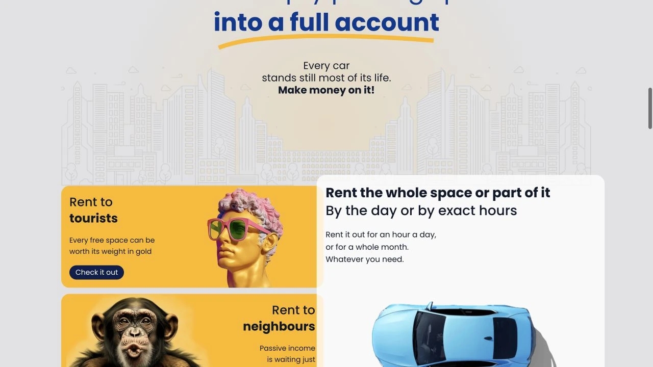
ParkApp — project detail 2

04 / Technology

$1,800

ParkApp

Turning a parking platform into a clear, engaging online story.

01 / PROJECT OVERVIEW

ParkApp explains a paid-parking platform for individual space owners, companies, and property communities, with separate paths for different audiences.

02 / DESIGN APPROACH

Blue type, warm yellow accents, and dimensional illustrations make the service distinctive. Audience-led sections and focused calls to action guide visitors through the offering.

03 / PROJECT DETAILS

ParkApp had a great product but a huge problem: they were invisible. An app that no one can find is a business that doesn’t exist. They needed a way to get customers.

So, I built them two foundational assets.

First, a logo that builds trust. In a world where people link their credit cards to apps, an amateur logo means $0 in revenue. I created an identity that signals security and professionalism.

Second, a digital storefront. Not just a ‘website,’ but a machine engineered to do one thing: convert visitors into users.

PROJECT BUDGET (USD)

$1,800

COLOR PALETTE

Blue / Yellow / Neutral

ParkApp — project detail 1
ParkApp — project detail 2
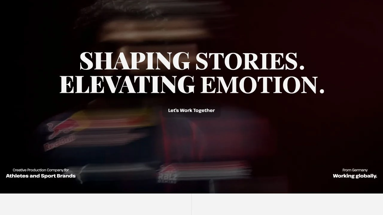
Outworkr — website preview
Outworkr — project detail 1
Outworkr — project detail 2

05 / Creative & Media

$2,000

Outworkr

A cinematic portfolio for sports stories and creative production.

01 / PROJECT OVERVIEW

Outworkr showcases a sports video production company working with athletes and sports brands, presenting films, campaigns, and production services.

02 / DESIGN APPROACH

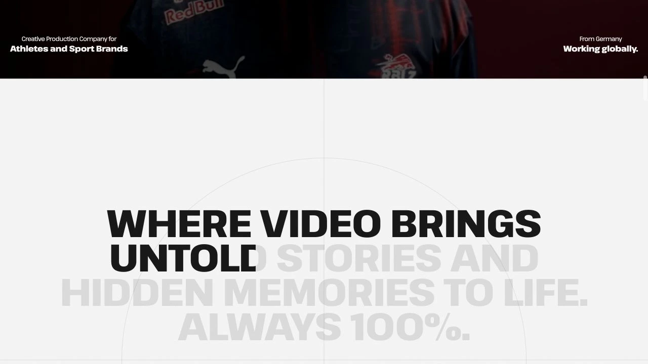
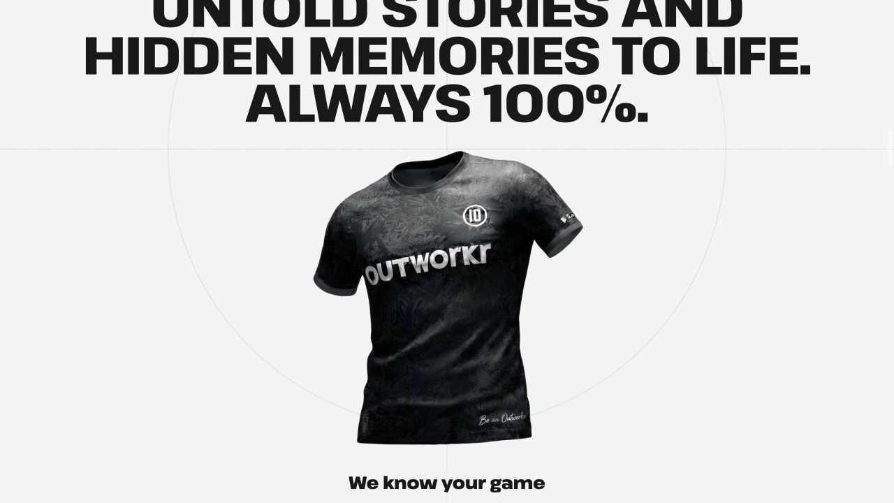
Moving-image compositions, strong typography, and a restrained interface give the work room to lead. Project stories connect the visual portfolio to the company’s production offering.

03 / PROJECT DETAILS

Outworkr is a video agency for athletes and sports brands, working with clients such as Red Bull, FC Bayern München, Adidas, Sky, and EA Sports FC. With a client roster like this, it was essential to create an online presence that reflects the same level of professionalism – and gives project managers in the industry a sharp, compelling first impression of both Outworkr and their work.

I am proud of this project – and so is the client 🙂

PROJECT BUDGET (USD)

$2,000

COLOR PALETTE

Black / Neutral

Outworkr — project detail 1
Outworkr — project detail 2
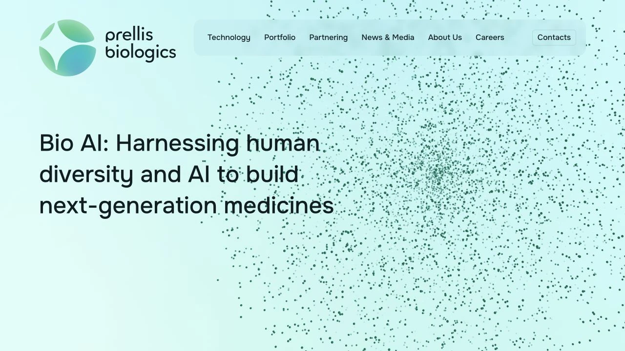
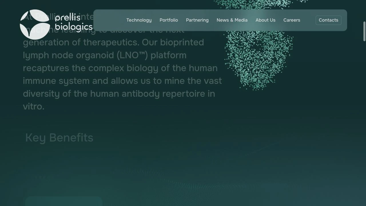
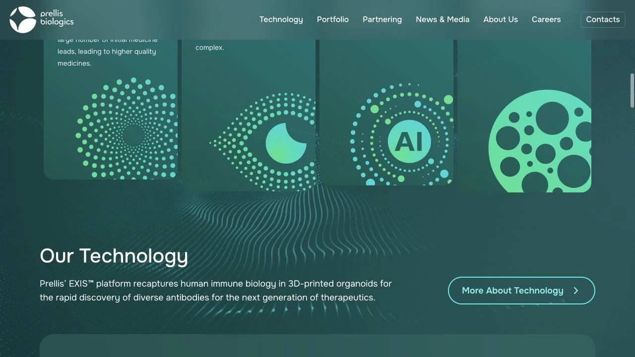
Prellis Biologics — website preview
Prellis Biologics — project detail 1
Prellis Biologics — project detail 2

06 / Biotechnology

$2,000

Prellis Biologics

A science-led website connecting human biology and AI.

01 / PROJECT OVERVIEW

Prellis Biologics presents its biotechnology platform, research portfolio, partnership information, and company news.

02 / DESIGN APPROACH

Mint and teal tones, animated particle imagery, and scientific graphics introduce the subject. A structured hierarchy separates technology, portfolio, and company information for different visitor needs.

03 / PROJECT DETAILS

Prellis Biologics operates at the intersection of human biology and artificial intelligence, developing technology that could change how new medicines are discovered.

Impressive science. Not exactly something you can explain in three sentences.

The challenge was turning a highly technical subject into a digital experience that feels both innovative and understandable, without sacrificing the credibility a biotechnology company needs.

I approached the design with a balance of science and simplicity. Clean layouts, subtle animations, sophisticated colors, and a clear visual hierarchy that guides visitors through the technology, research, and company story.

Because groundbreaking innovation deserves more than a complicated website. It deserves a platform that makes people understand why it matters.

PROJECT BUDGET (USD)

$2,000

COLOR PALETTE

Green / Blue

Prellis Biologics — project detail 1
Prellis Biologics — project detail 2
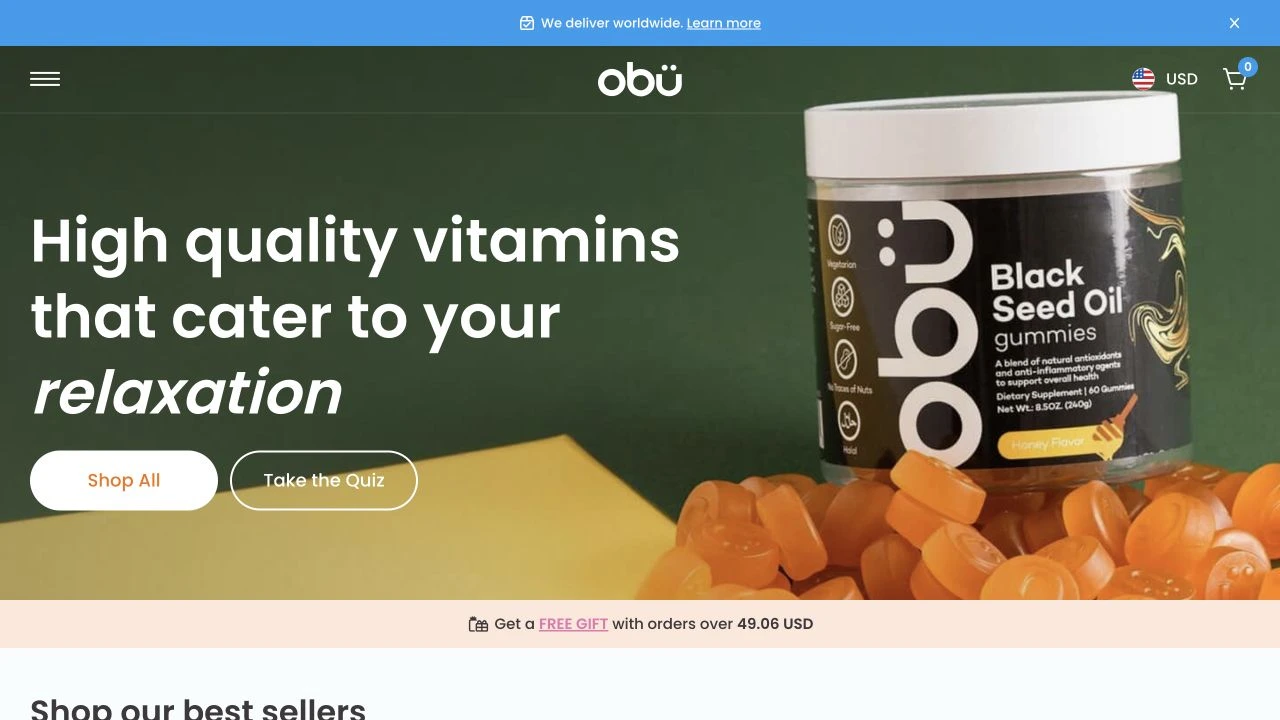
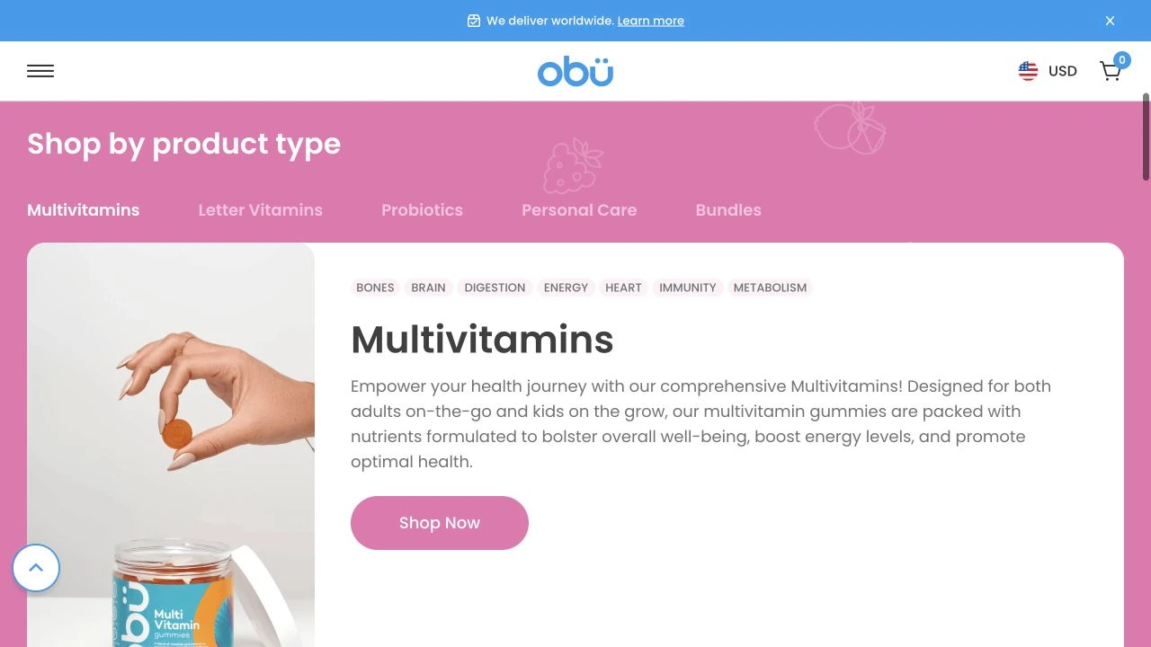
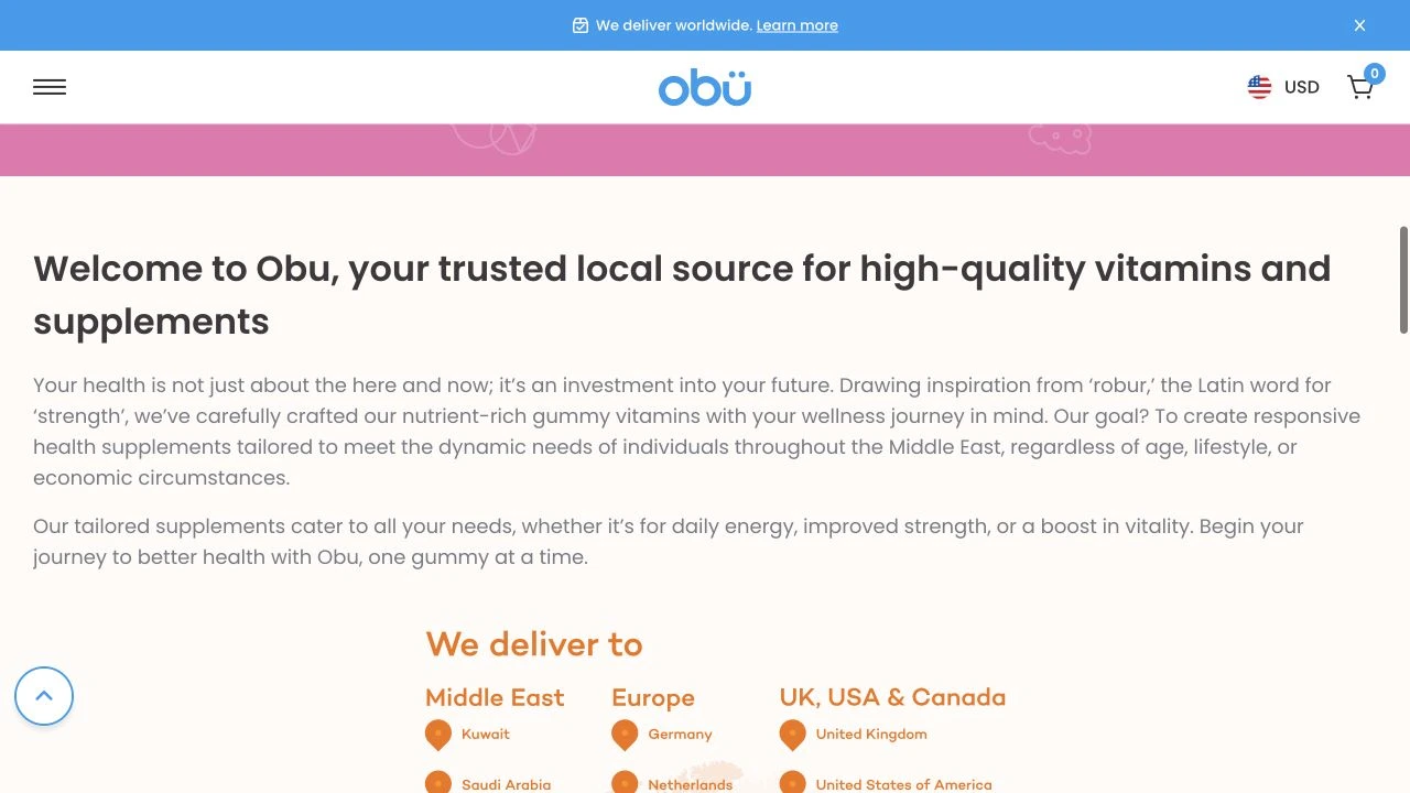
Obu Nutrition — website preview
Obu Nutrition — project detail 1
Obu Nutrition — project detail 2

07 / Health & Wellness

$1,800

Obu Nutrition

An upbeat shopping experience for vitamins and everyday wellness.

01 / PROJECT OVERVIEW

Obu Nutrition offers gummy vitamins and supplements, with product discovery organized around different wellness interests and product types.

02 / DESIGN APPROACH

Colorful packaging, large product imagery, and approachable typography bring energy to the storefront. Product categories, best-seller sections, and a quiz offer several routes into the range.

03 / PROJECT DETAILS

Buying vitamins should be simple. But when you’re faced with dozens of products, ingredients, and categories, finding the right one can quickly become a frustrating experience.

Obu Nutrition needed more than a colorful online store. They needed an experience that made exploring their products feel easy, enjoyable, and intuitive.

I built the website around one idea: make discovery effortless.

Playful colors, bold product photography, clear categories, and a shopping experience that gives visitors different ways to explore — whether they know exactly what they want or need a little guidance.

The goal wasn’t just to make the products look good. It was to make the entire shopping journey feel as approachable as the brand itself.

PROJECT BUDGET (USD)

$1,800

COLOR PALETTE

Blue / Pink / Orange

Obu Nutrition — project detail 1
Obu Nutrition — project detail 2
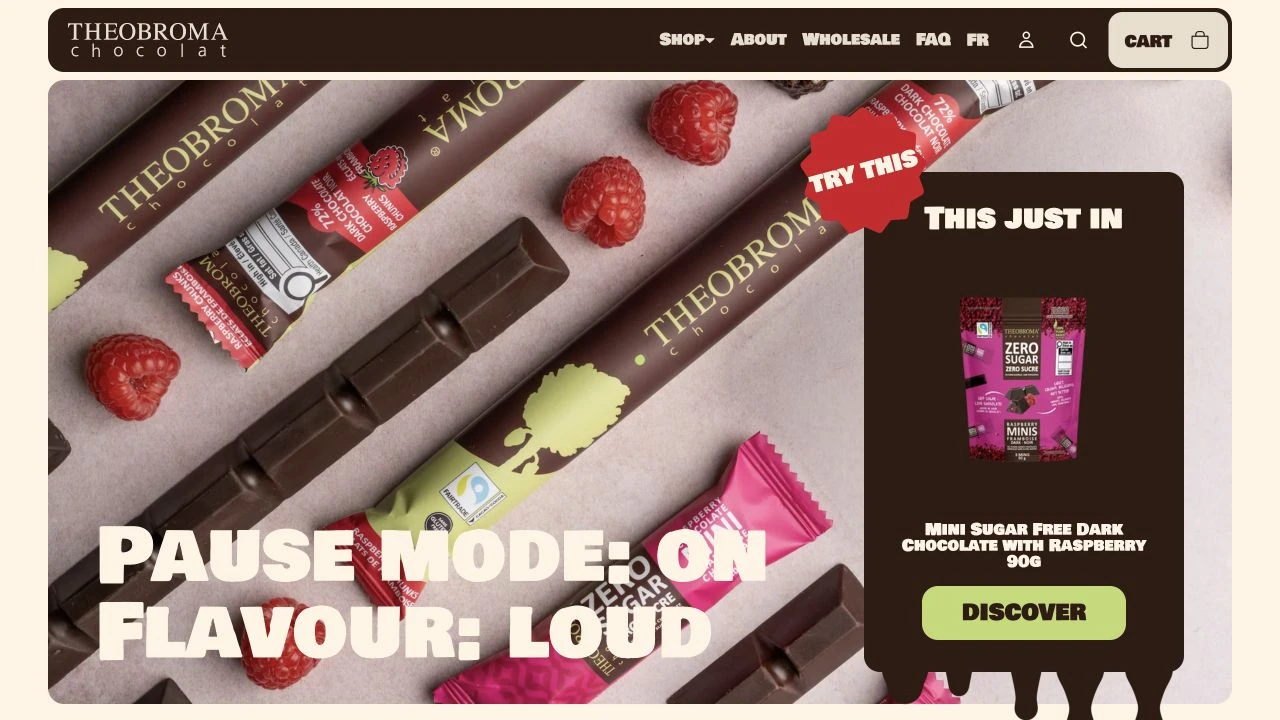
Theobroma Chocolat — website preview
Theobroma Chocolat — project detail 1
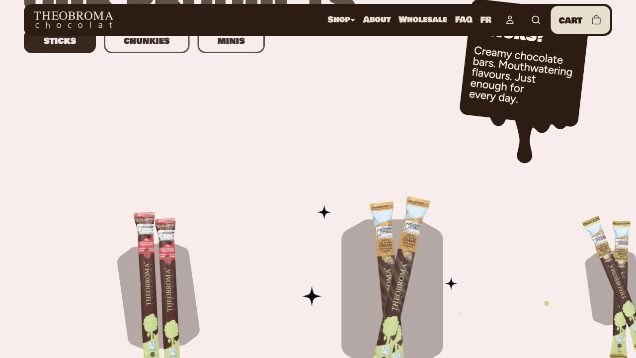
Theobroma Chocolat — project detail 2

08 / Food & Beverage

$2,500

Theobroma Chocolat

A playful, product-led storefront with chocolate at the center.

01 / PROJECT OVERVIEW

Theobroma Chocolat presents its chocolate range through distinct product families, featured flavors, brand information, and a direct shopping experience.

02 / DESIGN APPROACH

Chocolate-brown navigation, cream surfaces, oversized type, and colorful product photography create a confident visual world. Collection-led browsing keeps the product range organized.

03 / PROJECT DETAILS

Let’s be fair. Designing a website for chocolate is already a pretty sweet assignment.

But Theobroma needed more than beautiful product photos. With different collections, flavors, and a playful brand personality, the challenge was creating an online store that feels exciting without making shopping complicated.

I wanted the website to feel like opening a box of chocolate. Every section should make you curious about what’s next.

I combined oversized typography, warm cream backgrounds, rich chocolate tones, and colorful product visuals to create an experience full of character.

Behind the playful design, everything has a purpose. Clear product collections, intuitive navigation, and a shopping journey that keeps the focus exactly where it belongs: on the chocolate.

PROJECT BUDGET (USD)

$2,500

COLOR PALETTE

Brown / Pink / Neutral

Theobroma Chocolat — project detail 1
Theobroma Chocolat — project detail 2
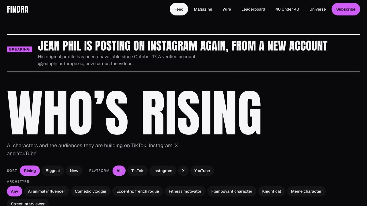
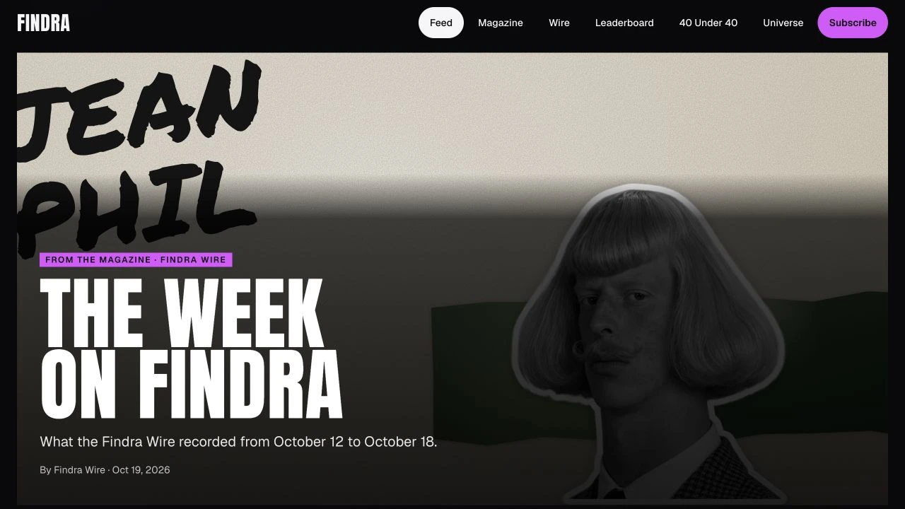
Findra — website preview
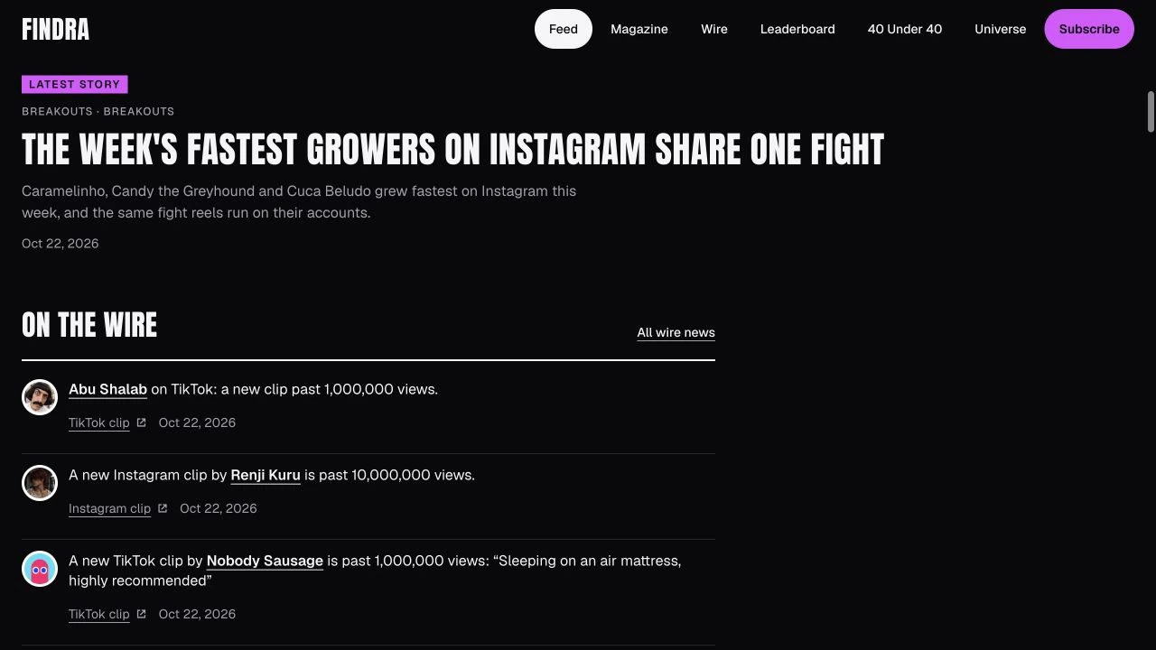
Findra — project detail 1
Findra — project detail 2

09 / Creative & Media

$2,000

Findra

A graphic editorial platform for AI characters and creative culture.

01 / PROJECT OVERVIEW

Findra brings together AI-character discovery, editorial stories, news updates, and rankings in a publication-style experience.

02 / DESIGN APPROACH

A black-and-white foundation, purple accents, condensed headlines, and compact navigation establish the editorial identity. Feed filters and clear content groupings help readers explore the platform.

03 / PROJECT DETAILS

Artificial intelligence is changing the way we create, discover, and interact with digital personalities. Findra is built around that world, bringing AI characters, creative stories, news, and rankings together in one place.

The challenge? A platform filled with interesting content can quickly become a platform where nobody knows where to look.

I approached Findra like a modern digital magazine.

Bold editorial typography, a strong black-and-white foundation, carefully placed purple accents, and a structured layout that gives every piece of content its own space.

The goal was to make discovery feel natural, whether someone is exploring AI characters for the first time or looking for the latest stories.

A little experimental. A little unconventional. But always easy to navigate.
PROJECT BUDGET (USD)

$2,000

COLOR PALETTE

Purple / Black / Neutral

Findra — project detail 1
Findra — project detail 2
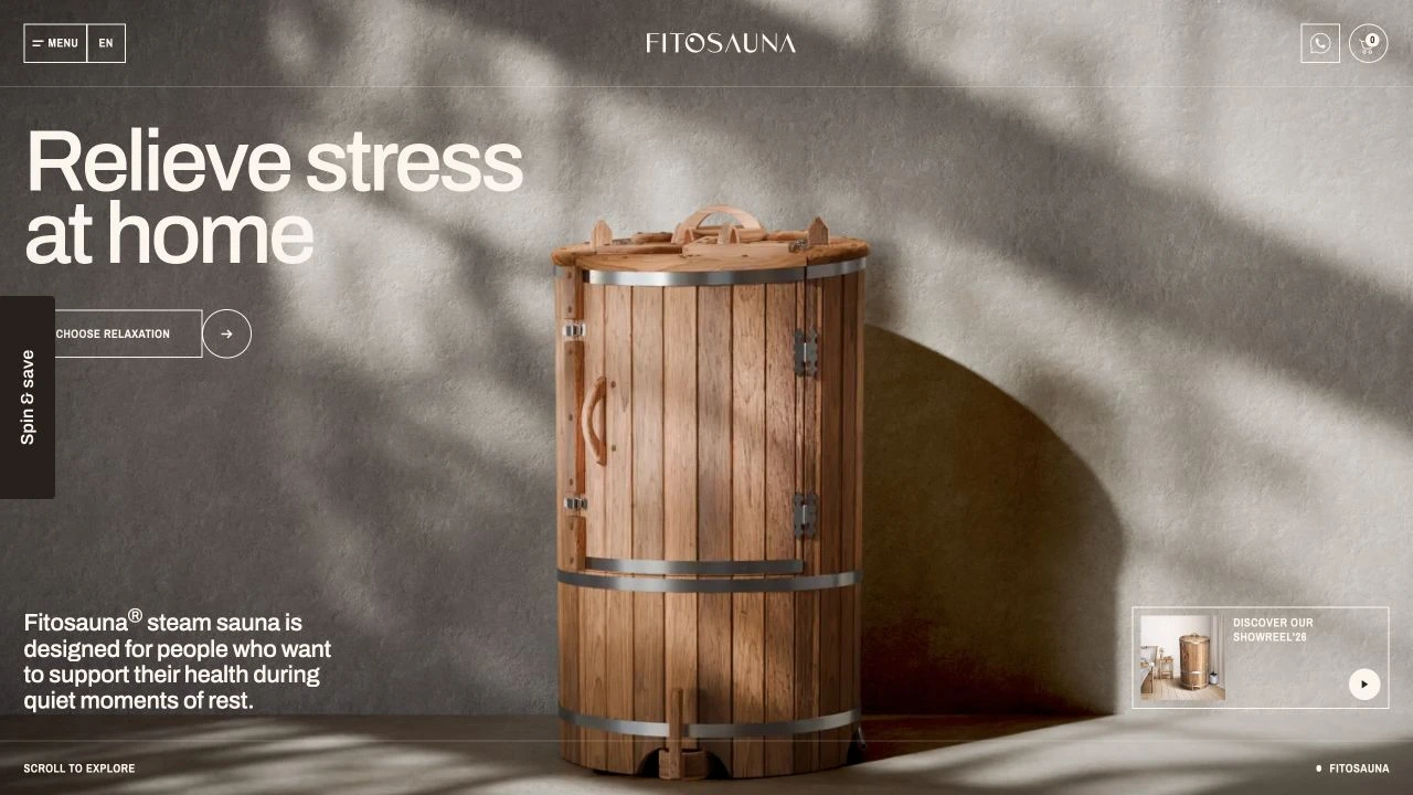
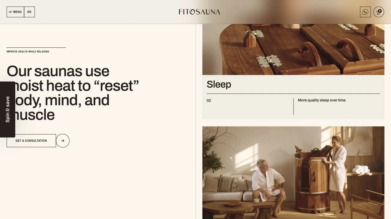
Fitosauna — website preview
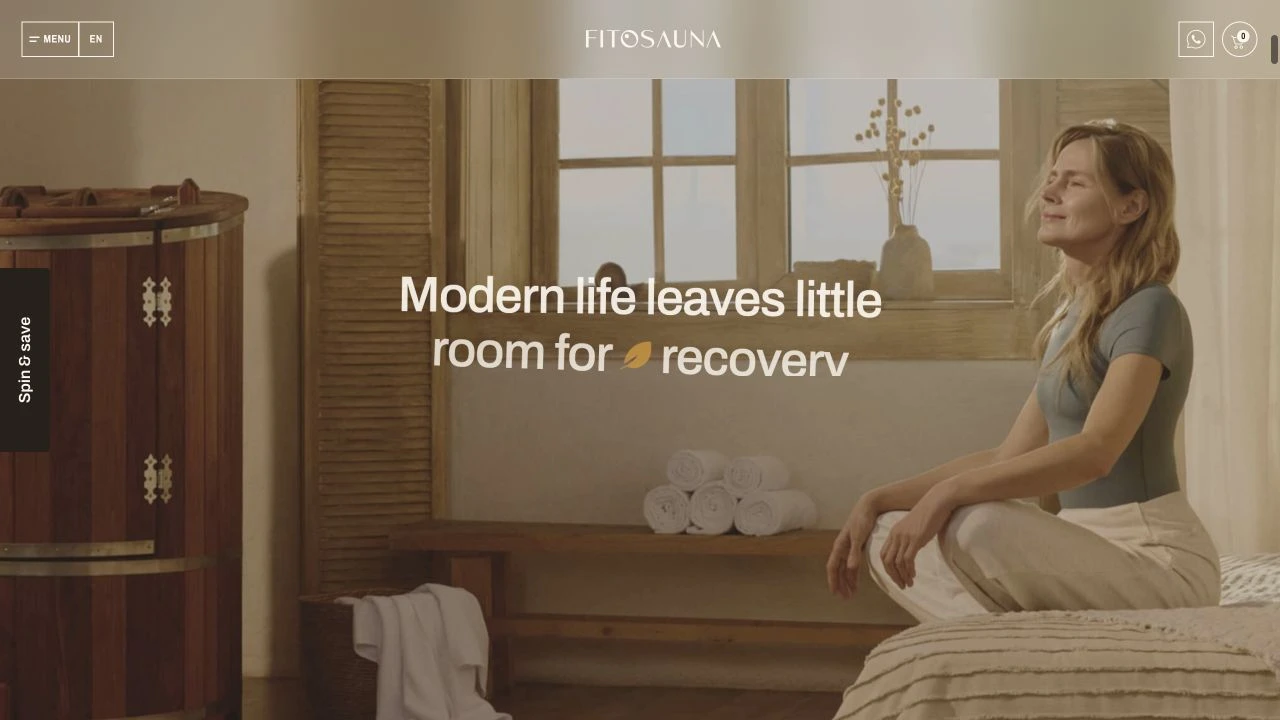
Fitosauna — project detail 1
Fitosauna — project detail 2

10 / Health & Wellness

$1,200

Fitosauna

A calm, immersive product experience for at-home relaxation.

01 / PROJECT OVERVIEW

Fitosauna introduces home steam saunas and related products, bringing product details, guides, and consultation paths into one website.

02 / DESIGN APPROACH

Natural wood imagery, neutral surfaces, spacious typography, and immersive product scenes establish a calm mood. Guided sections move from product introduction to practical details and consultation.

03 / PROJECT DETAILS

Fitosauna brings the traditional sauna experience into people’s homes. But selling a product like this online comes with a challenge: people need to understand more than what it looks like.

They want to know how it works, how it fits into their space, and what makes it different.

I wanted the website to answer those questions without overwhelming visitors with information.

The design combines natural textures, calming colors, elegant typography, and immersive product imagery to create an experience that feels peaceful from the first scroll.

Behind that simplicity is a carefully structured journey, from discovering the product to understanding its features and requesting a consultation.

Because a brand built around relaxation deserves a website that feels just as relaxing.

PROJECT BUDGET (USD)

$1,200

COLOR PALETTE

Brown / Neutral

Fitosauna — project detail 1
Fitosauna — project detail 2

A different combination?

No projects match these filters. Try another category, color, or budget.

Ten real projects across healthcare, technology, food, wellness, and creative industries. Explore the work by category, color, or project budget.

THE NEXT CASE STUDY COULD BE YOURS.

Let’s make
something matter.